The UI Audit We Wish More Teams Asked For
Your product works. Mostly. The flows are familiar. The nav still kind of makes sense. Nothing’s technically broken.
And yet, everything feels… off.
This post is for product managers, founders, and leads who’ve started asking themselves:
“Should we redesign?”
Before you book a redesign sprint — stop.
You might not need a redesign.
You might need a reckoning.
What’s Actually Going On? #
Redesigns fix visual inconsistency.
Audits fix functional drift.
Over time, your product collects:
– Legacy features no one questions
– Settings screens full of toggles you no longer support
– Microcopy that references workflows from three roadmaps ago
– Tooltips, modals, and checkboxes added “just in case”
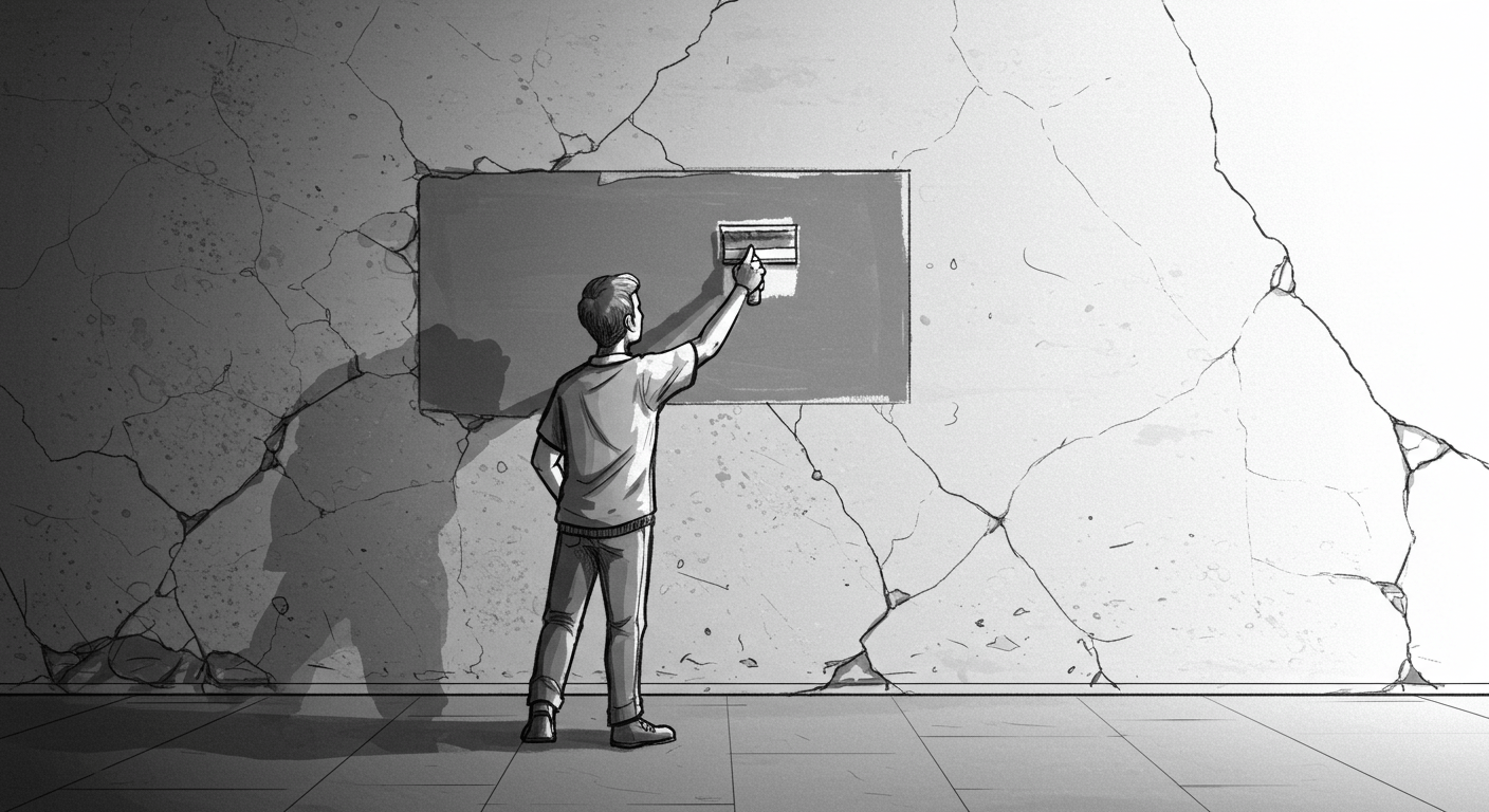
It’s not broken. It’s bloated.
Which means the fix isn’t a new coat of paint. It’s a hard look at what actually needs to be there.
Who Should Care (and Why) #
→ Product managers:
You’re making decisions based on how things look, not how they work. A UI audit helps you reduce scope creep, clarify feature strategy, and cut dead weight.
→ Founders and CEOs:
If your product’s UI still reflects your MVP-era thinking, users will feel that. A UI audit helps you re-align the interface with the business you’ve actually built.
→ Designers and UX leads:
You can’t redesign your way out of structural clutter. This gives you the input you need to prioritise what’s real — not just what looks nice in Figma.
DNSK’s UI Audit Checklist #
Here’s what we walk through before touching visuals:
1. Navigation sanity check
– Can each nav item be described in one sentence?
– Does the nav structure reflect the core user journey — or internal org structure?
2. Feature relevance audit
– Which pages have low/no usage?
– What feature hasn’t changed in 12+ months but still takes up UI real estate?
3. Microcopy reality check
– Are you overexplaining things that should be intuitive?
– Does the tone still match the audience?
4. Dead logic & abandoned flows
– Are there components still active in the UI but unsupported by backend logic?
– What can users technically click… that doesn’t go anywhere?
5. Visibility vs. clarity
– Is everything visible, but nothing obvious?
– Have you added explanation instead of solving confusion?
What to Do With the Answers #
Run this audit, then:
– Flag low-value components for removal or rework
– Surface any parts of the product that no one owns
– Clarify the gap between how it looks and how it’s used
This process gives you a clean foundation. One you can actually design from — instead of painting over broken parts.
Why Teams Skip It #
Audits aren’t sexy.
They don’t show up in portfolios.
They uncover things nobody wants to deal with (especially if a feature was someone’s favourite idea).
But if you skip the reckoning, your next redesign will just repackage confusion.
Final Thought #
A redesign is a risk.
An audit is a strategy.
If your product feels off but you’re not sure why — don’t reskin it.
Run a proper UI audit. Ask the hard questions. Rip out what doesn’t belong. Clarify what does.
Then — and only then — start designing again.
—
DNSK WORK
Design studio for digital products
https://dnsk.work