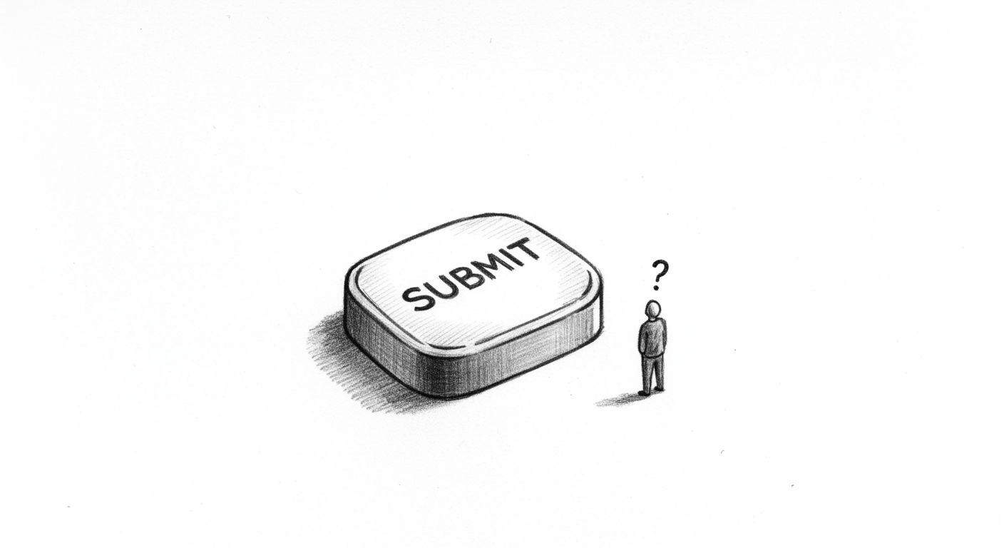
This Button Does Nothing
Every designer, at some point, ships a button that doesn’t work.
Maybe it launches a spinner that spins forever. Maybe it opens a modal promising a feature that hasn’t been built. Maybe it just… refreshes the page and hopes you don’t notice.
We don’t talk about these buttons much. They’re awkward. They’re compromises. But they happen — and they happen for a reason.
This post is about why we ship them, why they’re not always bad, and what every fake button is quietly telling your users.
The Illusion of Progress #
When you’re building fast, sometimes the UI gets ahead of the functionality.
The frontend team finishes a flow before the backend API is ready. The marketing team needs screenshots for launch day. The investor deck demands a polished product.
So you leave the button in. “It’s not wired up yet, but it shows intent.”
And honestly? That’s not a bad instinct.
A button that does nothing signals what will exist. It plants the idea: “You’ll be able to do this soon.”
And in early-stage products, signaling intent matters.
A Promise in Disguise #
But here’s the catch: a button is a promise.
Every affordance you show tells the user, “This is available to you.”
So even if you’re shipping that button as a placeholder, you’re training an expectation. You’re inviting trust. And trust comes with a clock.
The longer that button doesn’t work, the more it shifts from promise → tease → betrayal.
The first click: curiosity.
The second click: confusion.
The third click: frustration.
If you never deliver? That’s trust broken.
When It’s Okay #
We’ve shipped fake buttons. You’ve shipped fake buttons. Let’s be honest about when it’s a reasonable move.
- When you’re launching an MVP, and want to validate interest in a feature before building it.
- When it’s clear the feature is coming very soon (weeks, not months).
- When the button gives clear feedback that it’s not ready: “Coming soon,” greyed out, tooltip, etc.
- When it’s better to show incomplete functionality than no pathway at all.
In those cases? The button isn’t lying. It’s a placeholder with a disclaimer.
When It’s Not #
But fake buttons turn harmful when:
- They look active but do nothing (no message, no feedback, no clue).
- They stay fake for months while users keep trying.
- They mask critical missing functionality users were counting on.
- They erode confidence in everything else (“If this doesn’t work, what else doesn’t work?”).
In those cases? The button isn’t a placeholder. It’s a broken promise.
Our Favorite Offenders #
A few we’ve seen in the wild:
- “Save draft” buttons that don’t actually save drafts.
- “Upload image” buttons that open a file picker but don’t process uploads.
- Toggles that change state visually but don’t persist.
- Modals with “Cancel” buttons that still submit data.
- Checkout “Apply discount” buttons that… don’t.
Each shipped with good intentions. Each eventually fixed (we hope). Each a tiny UX lie.
The Real Question #
A fake button isn’t inherently bad. The real question is:
Is this button buying you time — or burning trust?
If you’re signaling something that will soon be real, and making that incomplete state clear? Great.
If you’re leaving it live because no one wants to remove it, and users are left guessing? Not great.
Every affordance is a tiny contract. Show it, and you owe it.
We’ve all shipped a button that didn’t do what it claimed.
Not because we’re bad designers. But because design happens under pressure. Deadlines. Dependencies. Dreams bigger than roadmaps.
That’s okay.
But every fake button starts a countdown.
You’ve promised something. Now you need to deliver. Or admit it won’t ship.
Because if you don’t?
That button’s not just decorative. It’s a trust leak. And trust doesn’t refresh with a page reload.
—
DNSK WORK
Design studio for digital products
https://dnsk.work