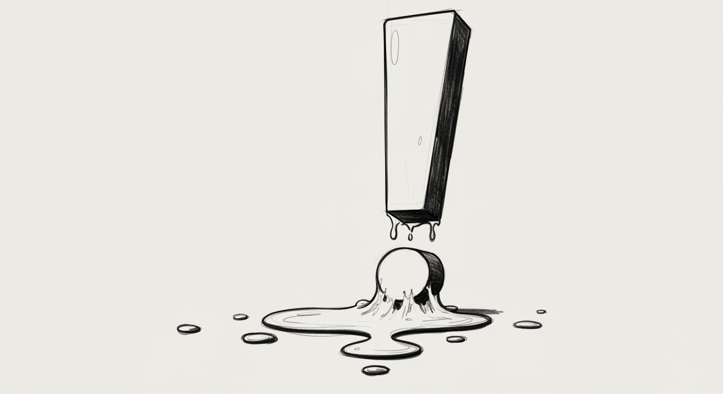
The Politeness Problem
Your product is nice. Too nice.
Everything says “maybe.” Every modal wants to know if it’s a good time. Every tooltip apologises for existing. It’s all lowercase and softly rounded — like if Helvetica had social anxiety.
We get it. You want to be helpful, human, inoffensive. You want to sound like a warm breeze.
But here’s the problem: no one trusts a UI that whispers.
The Tone That’s Too Careful #
Modern UX is obsessed with friendliness. But friendliness isn’t clarity.
You’ve seen this voice:
– The banner that says, “Heads up, something might not have gone quite right…”
– The empty state that gently chirps, “Looks like nothing’s here just yet, but that’s okay :)”
– The button that offers, “Let’s maybe try saving this now?”
It’s all just slightly damp.
What it doesn’t say:
– What happened.
– What to do next.
– Whether or not the product is in control.
Politeness ≠ Trust #
Let’s be clear. Users don’t want to be coddled. They want:
– Confidence
– Precision
– A UI that knows what it’s doing
Politeness avoids conflict. But real UX helps people make decisions.
When your product won’t commit to anything — a flow, an action, a sentence — users start assuming you can’t.
Because clarity signals competence.
Some Real Offenders (We’ve Fixed These) #
“Oops! Something might’ve gone wrong.”
→ What went wrong? What happens now? What do I do?
“This is taking a bit longer than usual!”
→ Is it broken? Should I reload? Will I lose progress?
“Are you sure you want to cancel? You’ll lose some data.”
→ What data? Which part? Why can’t I go back?
“Looks like you haven’t added anything yet!”
→ What should I add? Why? What does this screen even do?
“Let’s go!” on a CTA to delete your account.
→ No.
“Just a sec…” on a spinner that lasts 10+ seconds
→ That’s not a sec. That’s an eternity.
“We’re sorry, something’s not quite right.”
→ Just say what’s broken. Give next steps. Stop being poetic.
“Feel free to reach out if you need help!”
→ Where? How? When? With what?
“Click here to continue when you’re ready :)”
→ Ready for what? What happens next?
“You’re almost there!” in the middle of a 6-step form
→ No I’m not. I’m halfway.
Why This Happens (and Keeps Happening) #
Because teams are scared to sound wrong.
Or pushy.
Or like they know more than the user.
So the voice softens. The decisions get deferred. Everything becomes “just a suggestion.”
And then:
– No one takes action
– No one finishes onboarding
– No one believes your product is serious
The Copy Everyone’s Avoiding #
Here’s what you should be writing:
“We couldn’t save your changes. Try again or reload the page.”
“You’re about to delete this workspace. This action is permanent.”
“Your subscription will renew on June 12. Cancel anytime.”
Does it sound blunt? Yes.
Does it make you sound confident? Also yes.
This isn’t about being rude. It’s about being useful.
How to Know If You Have the Politeness Problem #
Ask yourself:
– Are you giving instructions or suggestions?
– Are you stating facts or hedging feelings?
– Are you actually helping — or just avoiding?
And most telling:
Would your product sound the same if it were delivering bad news?
If not, it’s a branding exercise — not a voice.
Design Teams: Don’t Let Legal Write Your UX #
This happens in bigger teams. Copy gets watered down by legal. Then overcorrected by marketing. Then re-softened by support.
What comes out the other end is:
– Vague
– Smiley
– Worthless
If your product is making important choices — chargebacks, data deletion, payment limits — your UI needs to act like it understands the weight of those choices.
Because if you won’t say it clearly? Users won’t believe you know what you’re doing.
Final Thought #
Soft tone is easy. Sharp UX is hard.
But sharp is what builds trust.
If your product never says anything clearly, it’s not being polite. It’s being evasive.
So be nice. But be direct. Be warm. But be honest.
Clarity isn’t cold. It’s respect.
Don’t let your product mumble.
Say the thing.
—
DNSK WORK
Design studio for digital products
https://dnsk.work