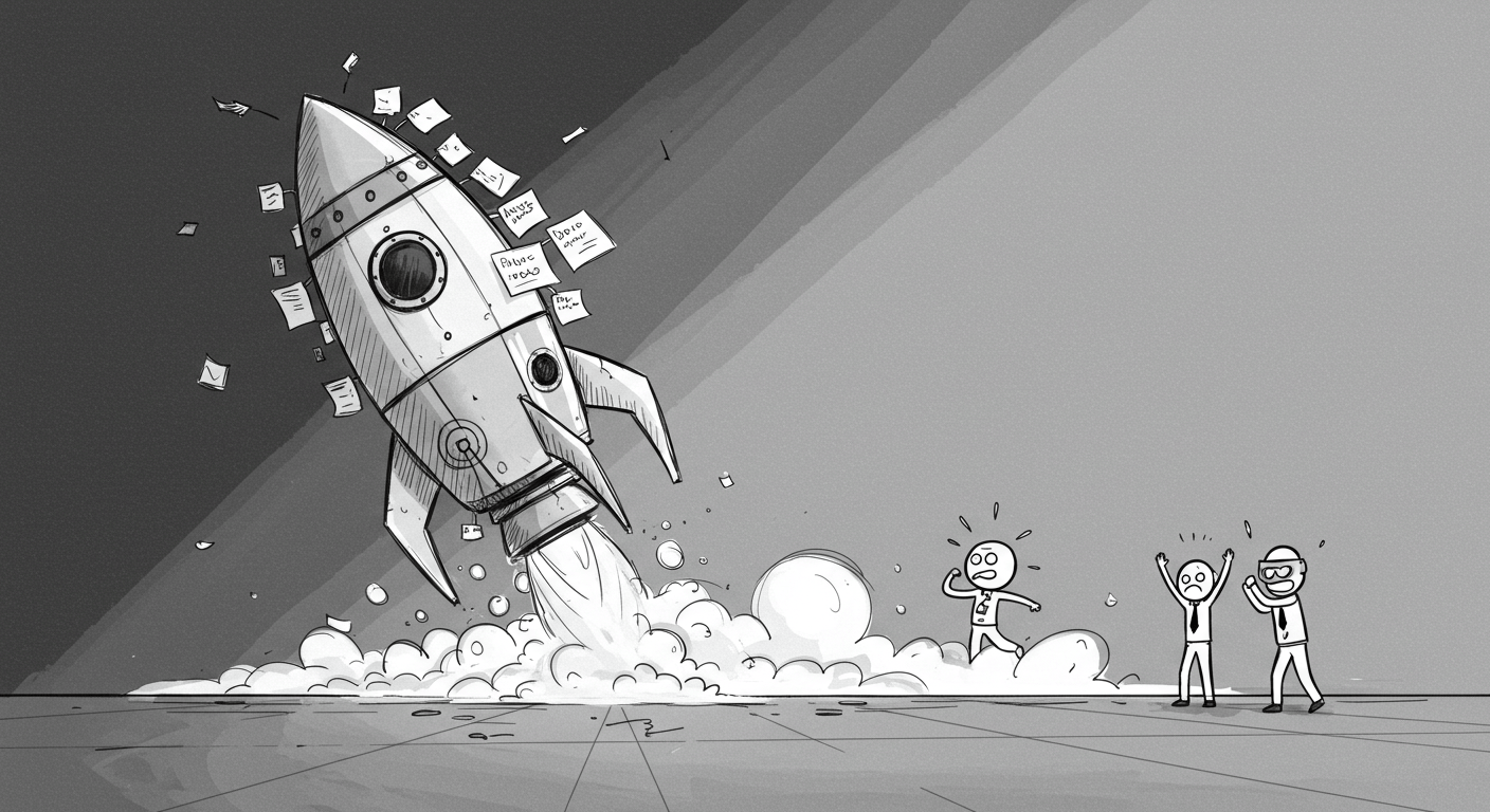
The First Version Is Supposed to Be Awkward
You know the one.
The MVP built by a freelancer over a long weekend, styled with inline CSS, powered by a Google Sheet and a thousand silent prayers.
And somehow — it worked.
The team raised money. Got users. Found traction. It looked like hell, but it proved a point. That something about the idea mattered.
That’s what a first version is for.
MVP ≠ Final Product #
A good MVP is supposed to make you slightly uncomfortable. If it doesn’t, you’ve probably spent too long smoothing out the wrong things.
You don’t need a design system. You need a working path from problem → value.
But here’s the bit founders forget: just because your awkward MVP shipped and survived… doesn’t mean it should stay that way.
First = Fast. Not Forever. #
There’s value in speed. There’s value in duct tape. But there’s also a moment when it turns into tech debt, UX rot, and product confusion.
We’ve seen it happen:
– MVPs that go unchanged for 18 months
– Design held hostage by early dev decisions
– Broken onboarding covered up with clever copy
It’s fine. For a while.
But if your product starts getting traction — and you don’t clean it up — it’s not scrappy anymore. It’s sloppy.
Users Will Forgive Early. They Won’t Forget Later. #
Your first 100 users don’t care if your UI is ugly. They care if it works.
But once you have traction? You can’t keep blaming the MVP.
– Users expect clarity
– Teams need systems
– Bugs stop being cute
– And half-built flows start costing conversions
You got away with awkward. Great. Now make it better.
This Is Where Most Products Stall #
We’ve been there. You’ve launched. You’ve got users. You’ve got just enough to keep going.
And suddenly… nothing changes.
The early chaos becomes sacred. Every weird edge case gets defended.
Every clunky screen becomes “fine for now.”
Until users stop onboarding. Or stop paying. Or just… stop.
Not because they hated it. But because it never evolved.
The Fix: Invest in UX When It Matters Most #
Don’t overhaul everything. But do look closely at:
– Where users drop off
– What gets explained (over and over again)
– What parts of the UI no one uses — or understands
Then fix the stuff that matters:
– Clarify your value prop
– Streamline your flow
– Design with intent, not inertia
You’re no longer proving your idea. You’re shaping the experience.
Final Thought #
Your first version should be awkward. Honest. Scrappy.
It should work just enough to prove people want it.
But the second version?
That’s where you stop surviving and start building.
And if you’re still duct-taping your UI while trying to scale your product — don’t be a twat.
Invest in proper UX. Work with people who’ve seen a hundred awkward MVPs and know exactly how to grow the thing that worked.
—
DNSK WORK
Design studio for digital products
https://dnsk.work