Let’s Not Build Portfolios for Algorithms
Not Everything Needs a CTA #
We’ve all seen them.
The clean, confident LinkedIn posts that promise to fix your design portfolio in five bullet points or less.
“Keep your colour scheme minimal.”
“Pick three projects.”
“Add a CTA to request the full deck.”
It sounds efficient. Actionable. Like you’re finally going to make progress on that dusty Figma file you’ve been avoiding.
But here’s the thing: portfolios aren’t landing pages. And you’re not running an ad campaign.
So why are we designing portfolios like we’re trying to boost conversion rates?
The LinkedIn Portfolio Industrial Complex #
Take this post we stumbled across the other day:
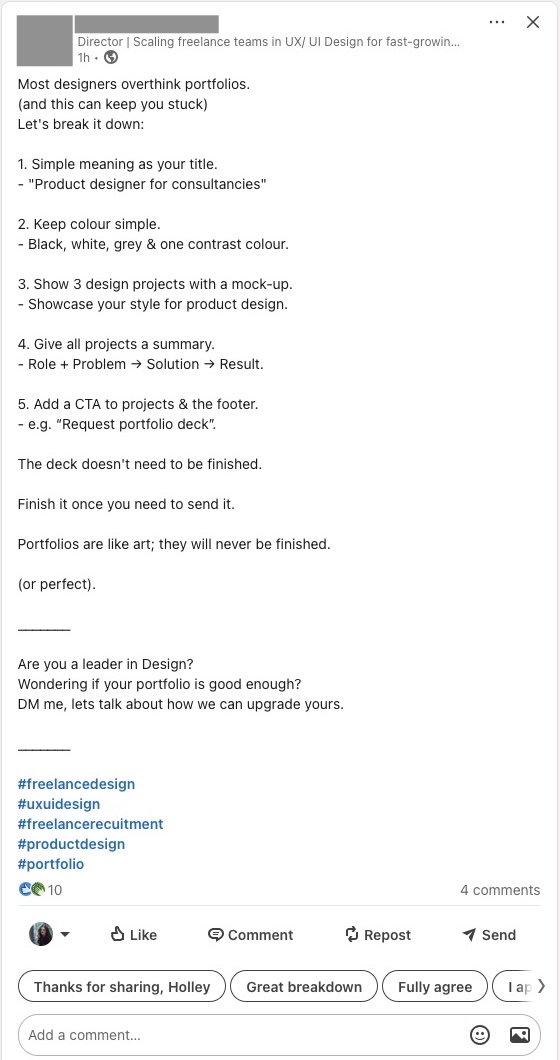
It’s not malicious. It’s not even wrong — for a certain kind of designer, at a certain point in their career.
But advice like this spreads because it feels safe. It gives structure. It’s tidy. And when you’re stuck, anything that helps you feel like you’re moving forward is seductive.
The problem is, this kind of advice flattens the craft. It reduces portfolios — which should be rich, strange, and deeply personal — into sales collateral.
Design isn’t simple. It’s nuanced. So your portfolio shouldn’t be overly simple either.
What Portfolios Are Actually For #
A portfolio isn’t there to convince someone to click a button. It’s there to:
– Show how you think
– Communicate what it’s like to work with you
– Reveal how you navigate ambiguity, feedback, and constraints
In short, it’s there to help someone imagine you solving their problem — not admire the buttons you already designed for someone else.
We don’t need more case studies that look like pitch decks. We need more portfolios that read like conversations — honest, reflective, and clear.
Why This Advice Misses the Mark #
Let’s take a few of the “greatest hits” and play them out:
“Limit it to three projects.”
Why? What if two of them are very similar? What if the project you’re proudest of isn’t visual at all? The number of projects matters less than the depth of insight they offer.
“Use one accent colour, max.”
That might work for a design test. But if you’ve worked on a healthcare dashboard, a fintech app, and an internal tool for logistics — shouldn’t each project feel different?
“Add a CTA to ‘Request Full Deck.’”
Are you trying to be helpful, or are you trying to generate leads? A good portfolio makes people want to talk to you — you don’t have to trick them into doing it.
This kind of advice turns real thinking into a formula. And if your work is formulaic, maybe that works. But if your design practice is real — messy, iterative, collaborative — then your portfolio should reflect that.
So, What Should a Portfolio Do? #
It should help people see your mind at work.
Here’s what that might look like:
– Show how a vague, messy brief turned into a usable product
– Explain the trade-offs you had to make (and what you learned)
– Include one project that failed — and what you’d do differently now
– Write in your own voice. Seriously.
You don’t need to “frame your value.” You need to show how you approach complexity — with rigour, honesty, and a bit of style.
A Better Structure (That Isn’t a Formula) #
If you need a starting point, try this:
– One paragraph about who you are and how you work
– Two to four projects, each with:
– Context (company, challenge, your role)
– What you did, how you approached it, what you learned
– Screens or artifacts only where they help the story
– Optional extras: a short writing sample, side projects, experiments
And yes — it can be unfinished. So are most real projects.
Design portfolios aren’t sales funnels. They’re not glossy brochures. They’re not content marketing.
They’re personal. They’re complex. They’re imperfect.
Just like real design work.
So if you’re feeling stuck and tempted to follow the “5-step plan to portfolio perfection,” take a breath. Step back. And ask yourself:
What kind of work do I want to be doing — and does my portfolio reflect how I get there?
If it does, then don’t worry about the accent colours.
—
DNSK WORK
Design studio for digital products
https://dnsk.work